.png)
Pillnotes
Team
3 student engineers
Role
Fullstack Developer
When
Jan - Dec 2019
Overview
Choosing the right medication is not always easy. In this project, I designed a comparison app to help doctors decide which medications are best for their patients.
Our startup was awarded Yale University's Tsai CITY Fellowship and was granted the opportunity to participate in CITY’s summer accelerator. Over the course of 8 months with 2 fellow Yale students, I built and piloted Pillnotes in 2 hospital locations.
The Problem
For doctors, comparing medication options is exhausting.
While medication information is widely accessible online, much of it is scattered on individual pill pages, with no easy way of comparing two or more similar options. Physicians must resort to the old-fashion method of opening new tabs every time they want to look up essential information for each pill. As a result, physicians often feel even more fatigued, which detracts from their interactions with their patients.
For example, this is how essential medication information is displayed on reputable sites like UpToDate:

Search results for a medication (UpToDate)
Designs
Inspiration
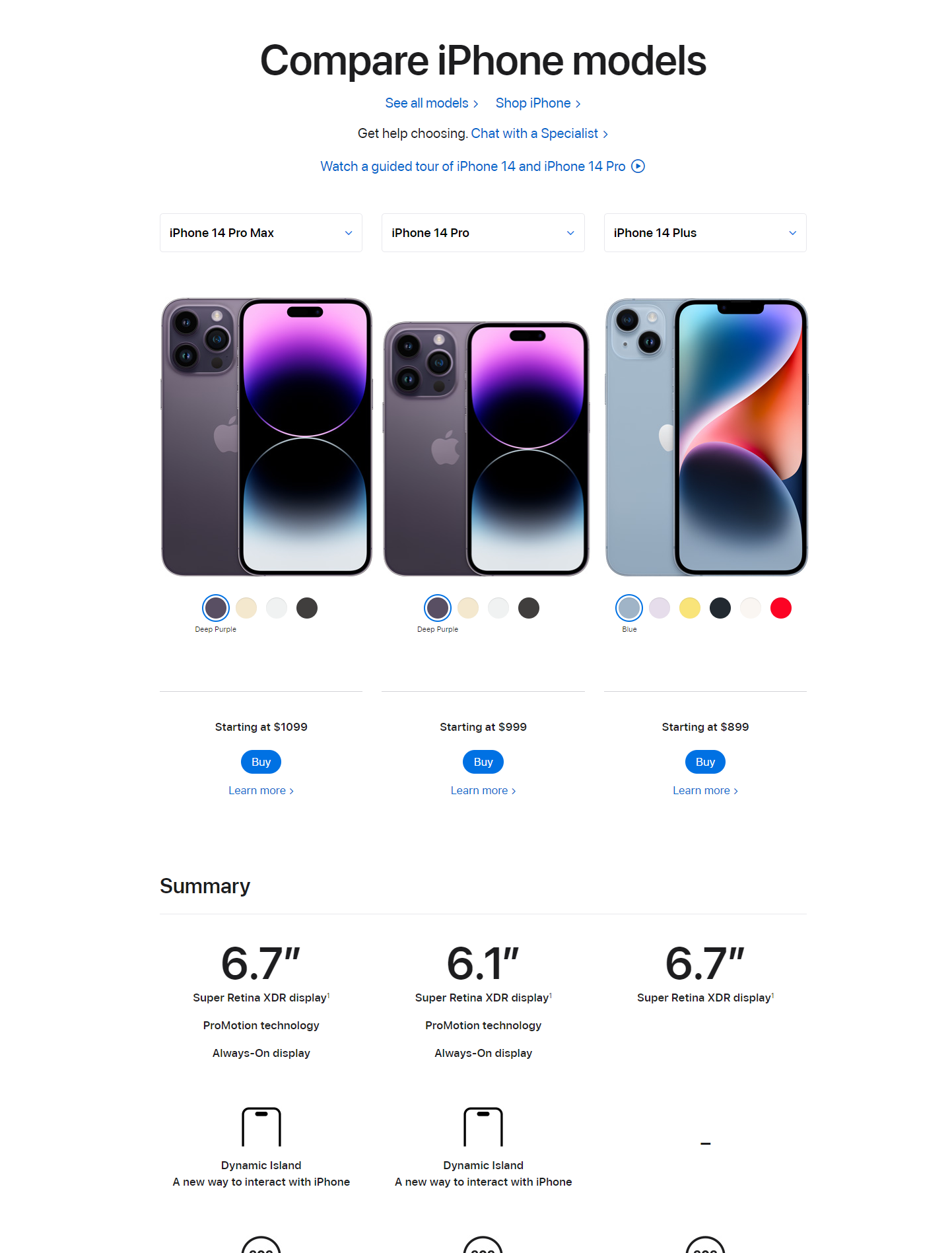
When we began ideating possible solutions, we took inspiration from comparison tables for buying smartphones. These tables provided organization to all the various attributes of the products, which allowed customers to easily compare the attributes most important to them.

Compare iPhones Inspiration
Prototype
I developed our MVP with basic functionality, including Search, Selection, Display, and Sharing capabilities to receive early feedback from early users.

Pillnotes MVP
Pilot Launch
In July 2019, we launched a pilot in 2 locations–Connecticut Mental Health Center and West Haven VA Medical Center. We made iterative improvements to our MVP to achieve our final designs above.

Compare Meds Page

Home Page

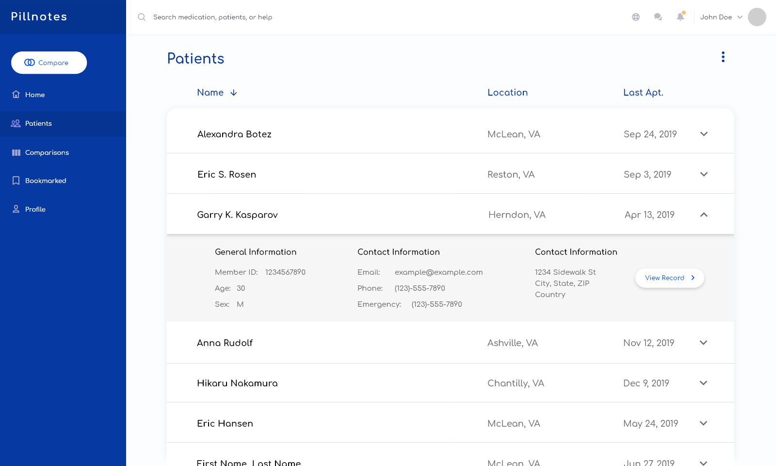
View Patients Page
Results
Pilot Launch
In July 2019, we launched a pilot in 2 locations–Connecticut Mental Health Center and West Haven VA Medical Center. We made iterative improvements to our MVP to achieve our final designs above.
What I Learned
User-Centric Design
The greatest challenge for me was learning to design specifically for doctors, who have a unique set of challenges and assumptions that I initially did not relate to. My own intuitions of what was natural or desirable were often wrong, and I had to quickly learn to separate my own preferences from the design. I learned to constantly ask myself “what assumptions am I making right now ?” Once I built a habit, I became better equipped to tackle the problem at its core.

Nike
Team
Converse Digital Product
Role
UX Design Intern
When
Jun - Aug 2021
Overview
As a UX design intern at Nike in the summer of 2021, I focused on enhancing the UX for Converse.com. I optimized the product detail page (PDP) to help users buy the shoes they love.
User Research
I conducted user research through user interviews to identify pain points on the PDP.
- Reviews: Users valued customer reviews but found no easy way to get to it in the right sidebar.
- Add to Cart: Users disliked having to scroll back up to add items to their cart, highlighting the need for a sticky button for easier access.
- CTA Clarity: While users knew they needed to select a color or size, they struggled with the starting process.

In order to see reviews, users must manually scroll down several screens.

In order to add-to-cart, users are required to pick a size.
The Problem
Navigational challenges on the PDP experience inhibit users from finding the shoe they love.
Designs
Flow 2: Profile Notification
An actionable notification to review profile

1. Notification

2. Confirm

3. Update Profile
Results
UX Impact - Metrics
- Increased add-to-cart conversion by +5.9%
- Reduced bounce rate by 2.8%Increased engagement with Reviews by +2.6%
.svg)
.svg)
